- Date: October 19, 2024
- Categories: Healthcare
About the Project
Digital ecosystem of pharmacy
Backstory
HPN has been a trusted resource for pharmacists and students for over a century, but its website had become outdated and hard to use. Members struggled with navigation, event registration, and managing memberships, leading to inefficiencies and frustration. As digital services grew, it became clear the website no longer met users’ evolving needs.Recognizing the need for change, HPN embarked on a complete website redesign. The goal was to develop a modern, user-friendly platform that addressed the pain points of its members. Designed a streamlined website that simplifies navigation, membership management, and resource access, with a fresh, professional look.The redesign improved user experience and ensured the platform could support future growth.
In short, the redesign was more than just a facelift—it was about making HPN a better digital space for its community, one that would support its members for many years to come.
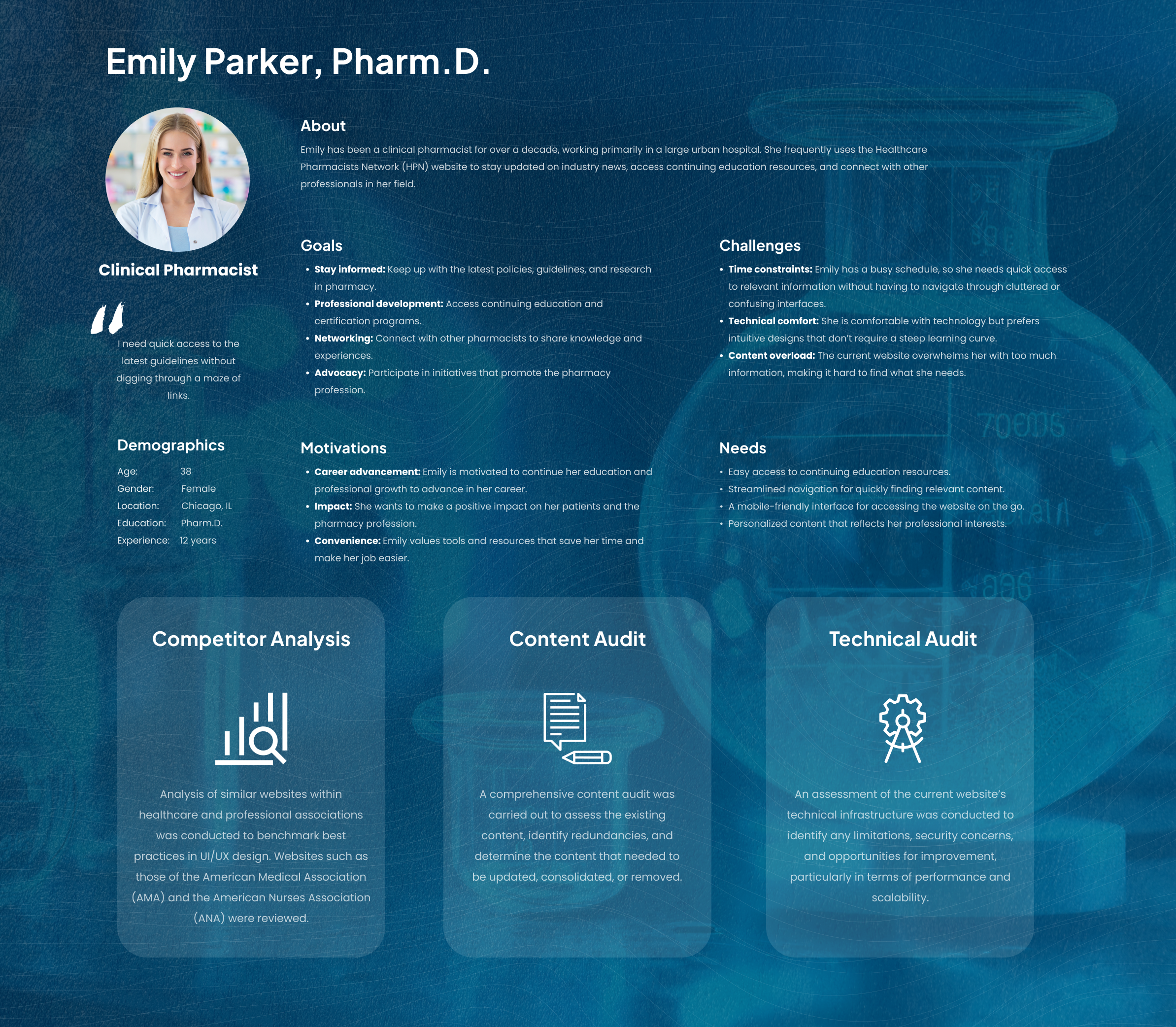
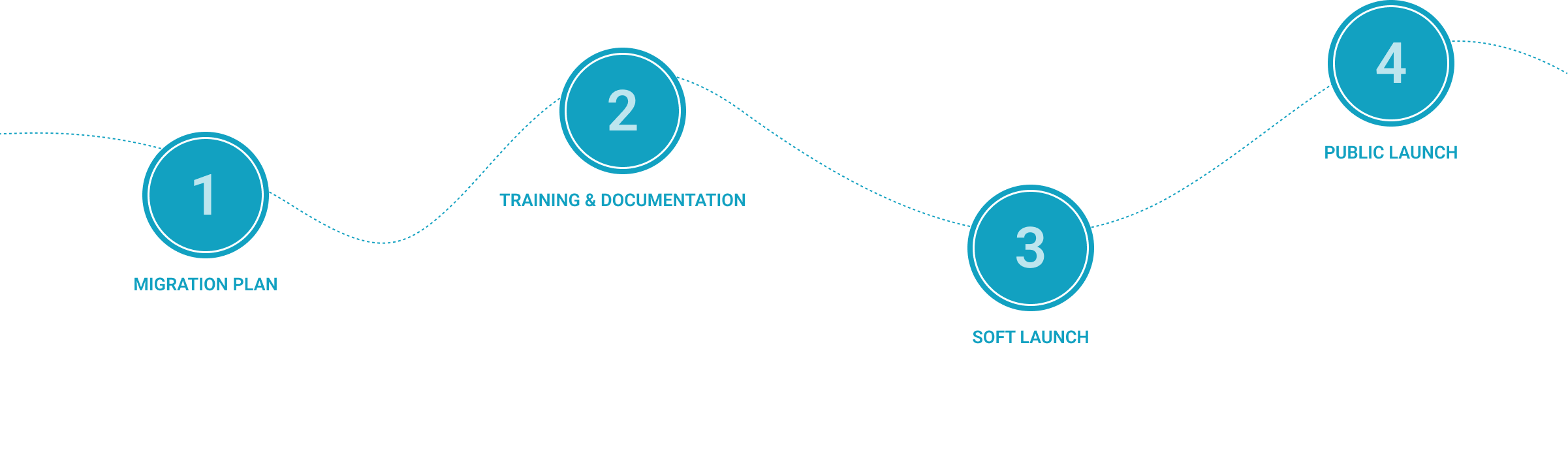
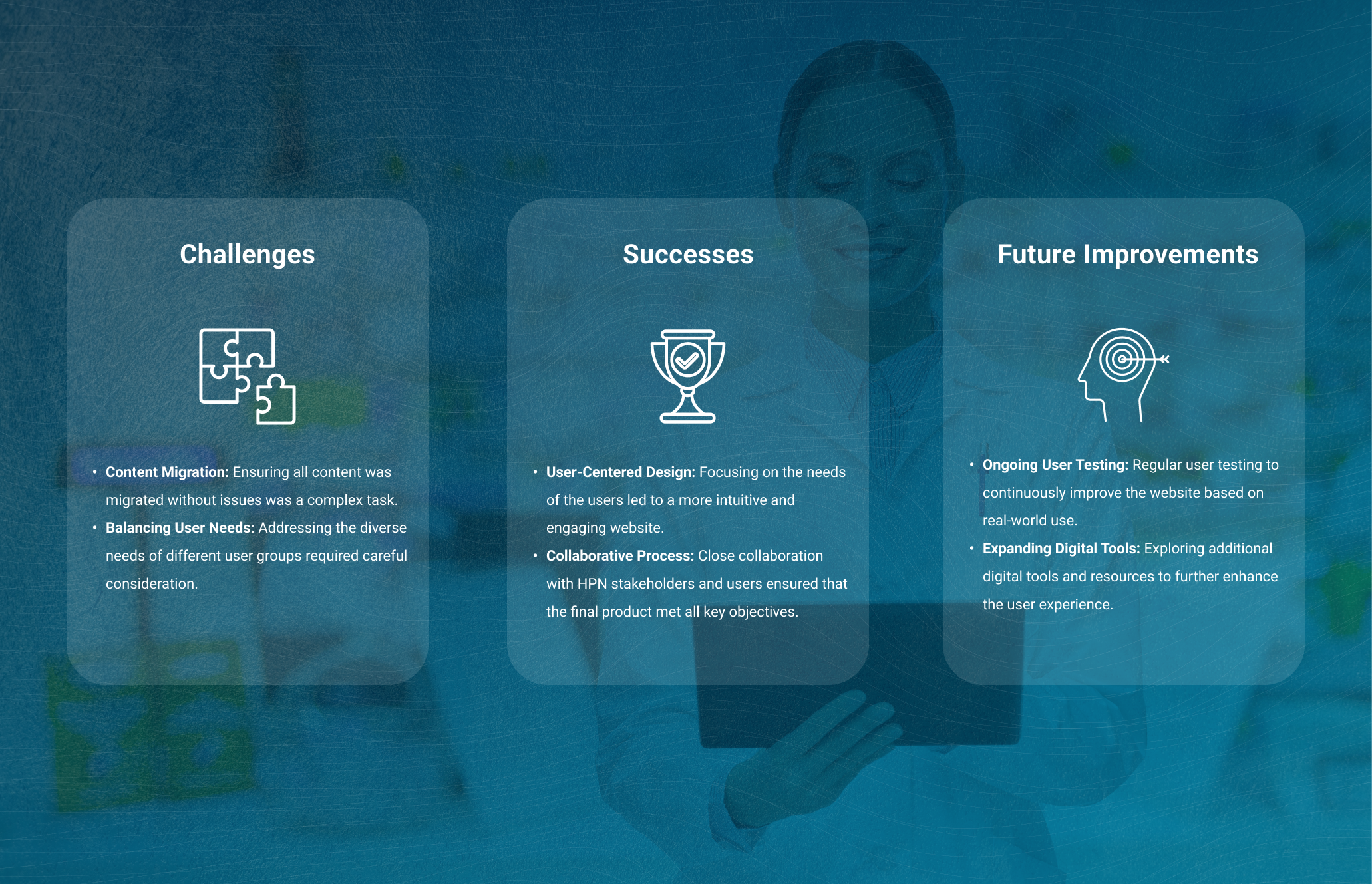
Challenges & Solutions
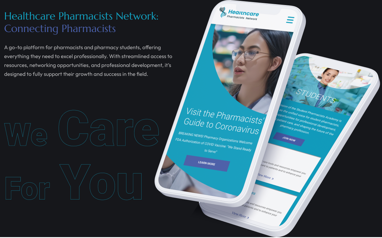
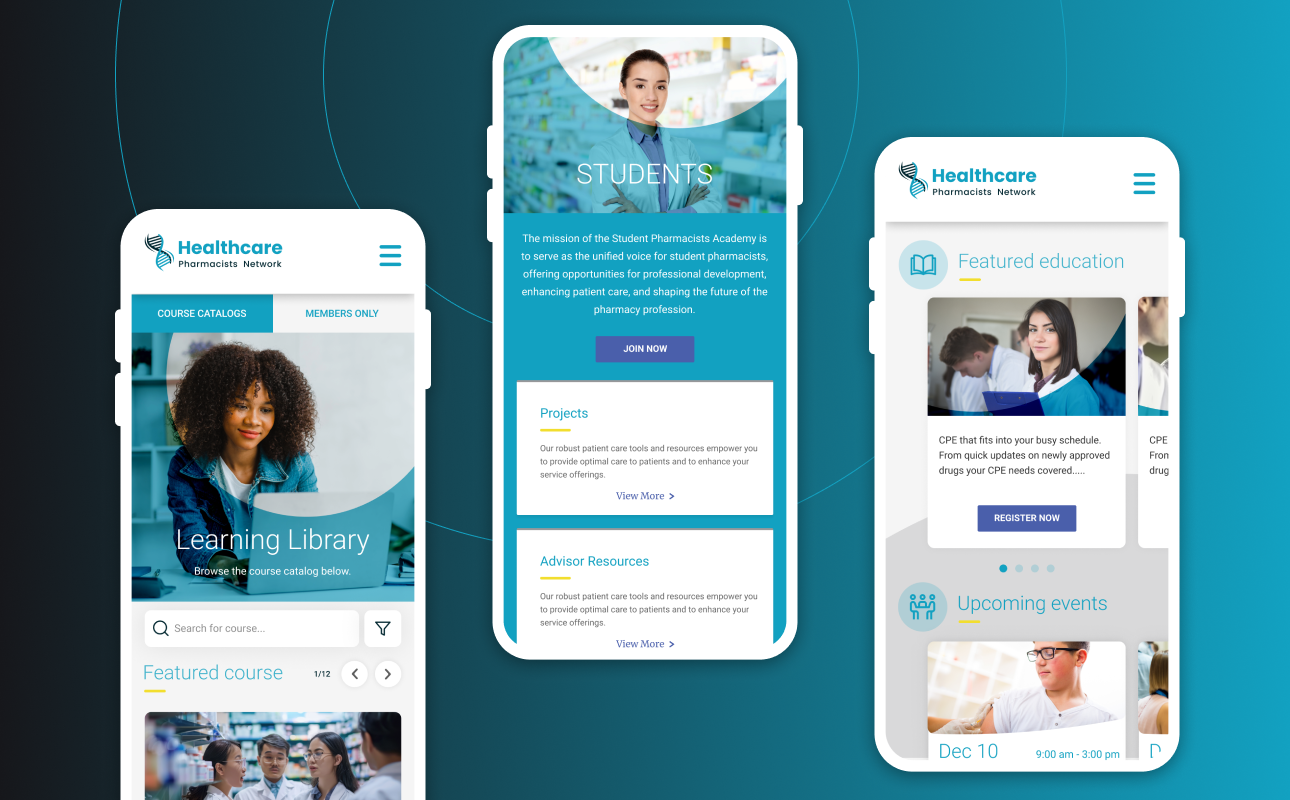
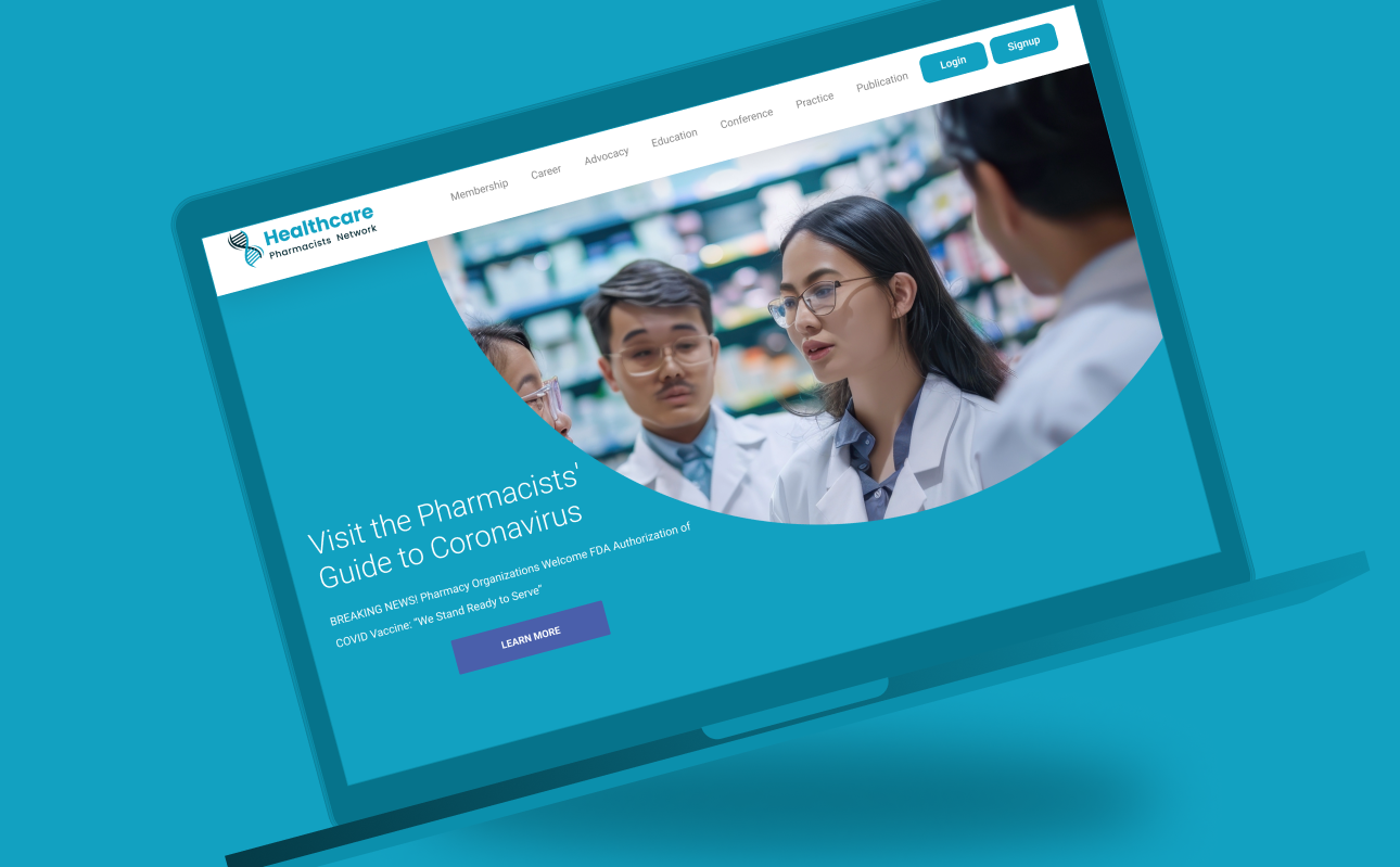
Creating a modern, clean look and implemented a new, intuitive navigation structure. Including a mega menu for better content discoverability and a more straightforward site map to help users find resources and information more easily.
Incorporating features such as text-to-speech functionality, keyboard navigation, and high-contrast visual elements. Conducting regular accessibility audits to ensure the site was inclusive and compliant with relevant guidelines, making it accessible to users with disabilities.
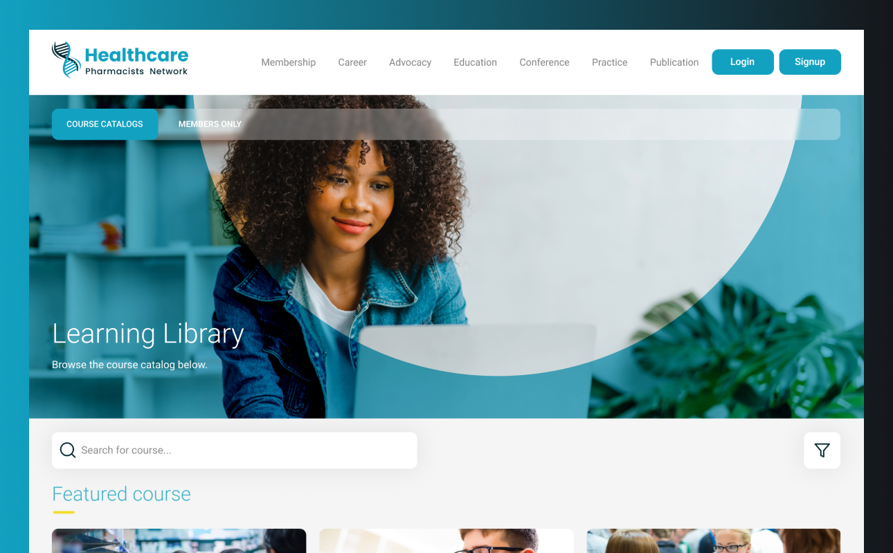
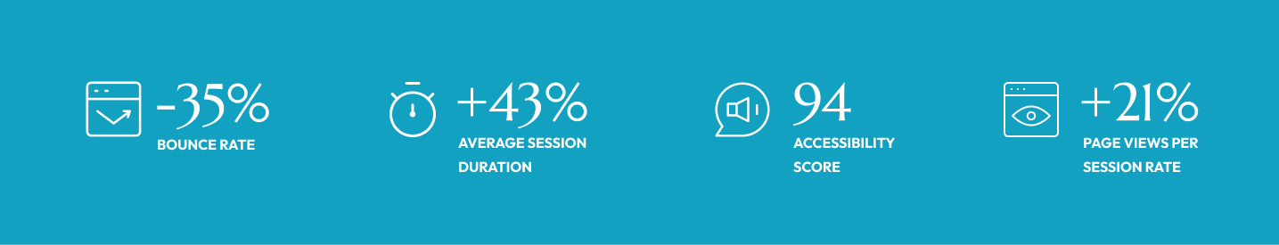
Redesigning event registration to be more user-friendly. Introducing a simplified, step-by-step registration system, along with clear instructions and a streamlined checkout process. This helps the users to find, register for, and manage events, easily, reducing confusion and improving participation rates.
Integration of a new membership management system that streamlines processes for membership renewals, profile updates, and access to member benefits. Featuring user-friendly interfaces and automated workflows to reduce administrative burden and enhance the overall user experience.
Impacts
Research & Analysis
Interviewing Pharmacists
- How easy or difficult is it to find the information you need?
- Can you describe any frustrations or challenges you’ve experienced while using the site?
- How would you rate the event registration process, and what could be improved?
- Have you ever had issues managing your membership or accessing educational resources? If so, what happened?
- If you could change one thing about the website, what would it be?
- How do you typically access the site (e.g., desktop, mobile), and how would you describe the experience on those devices?
Persona
Emily Parker, Pharm.D.
Designing Visual Identity for a Modern and Seamless Experience
Icons
The icon strategy for HPN aims to enhance the user experience by creating a visual language that is intuitive, modern, and aligned with the site’s goals. Icons should simplify navigation, improve accessibility, and support the overall aesthetic of the redesigned website.
Brand Color
Selection of green and blue for their brand colors to convey trust, professionalism, and a commitment to health. Green represents stability and growth, while blue underscores professionalism and clarity, enhancing user experience and credibility. Together, these colors create a modern, engaging look that supports HPN’s mission and values.
Bringing Design to Life
Visuals


Crafting Intuitive Web Interfaces
At the heart of every great experience lies Thoughtful Design and Clear Communication, crafting connections that resonate.


Implementation & Launch
Post-Launch & Results
User Feedback
Post-launch surveys and feedback forms were distributed to gather user opinions on the new design. The feedback was overwhelmingly positive, with users appreciating the improved navigation, modern design, and faster load times.
Ongoing Maintenance
A plan was put in place for ongoing maintenance, including regular updates, security checks, and content audits to ensure the website remains up-to-date and relevant.
Analytics & KPIs
Key performance indicators (KPIs) were tracked to measure the success of the redesign, including:
Increased User Engagement
Measured by time spent on site, pages per session, and reduced bounce rates.
Improved Conversion Rates
Higher membership sign-ups, event registrations, and resource downloads.
Enhanced Accessibility
Positive feedback from users with disabilities and higher compliance with WCAG standards.
Better SEO Performance
Improved search engine rankings and increased organic traffic.